
【OBS-compatible】Comments Widget
Comments Widget for OBS
The Comments widget is an OBS widget that displays YouTube Live chat on your stream with a design of your own. Comments are fetched through YouTube's official API (the YouTube Data API), so there is no Google account to link and nothing to change on the broadcast side.
To use it, paste your stream's URL into the controller and press "Connect", then add the published URL to an OBS "Browser" source.
Fonts, text colors, box fills, and borders are all adjustable, so instead of mirroring the raw chat panel you can show comments in a look that matches your stream.
Connect to a YouTube Live Stream
You choose which stream's chat to display from the comment controller. Here is how to connect:
- Open the comment controller. It appears below the editor, and you can also open it in a separate window from the OBS integration panel or scan its QR code to open it on your phone.
- Paste the stream's URL into the input field.
- Press "Connect".
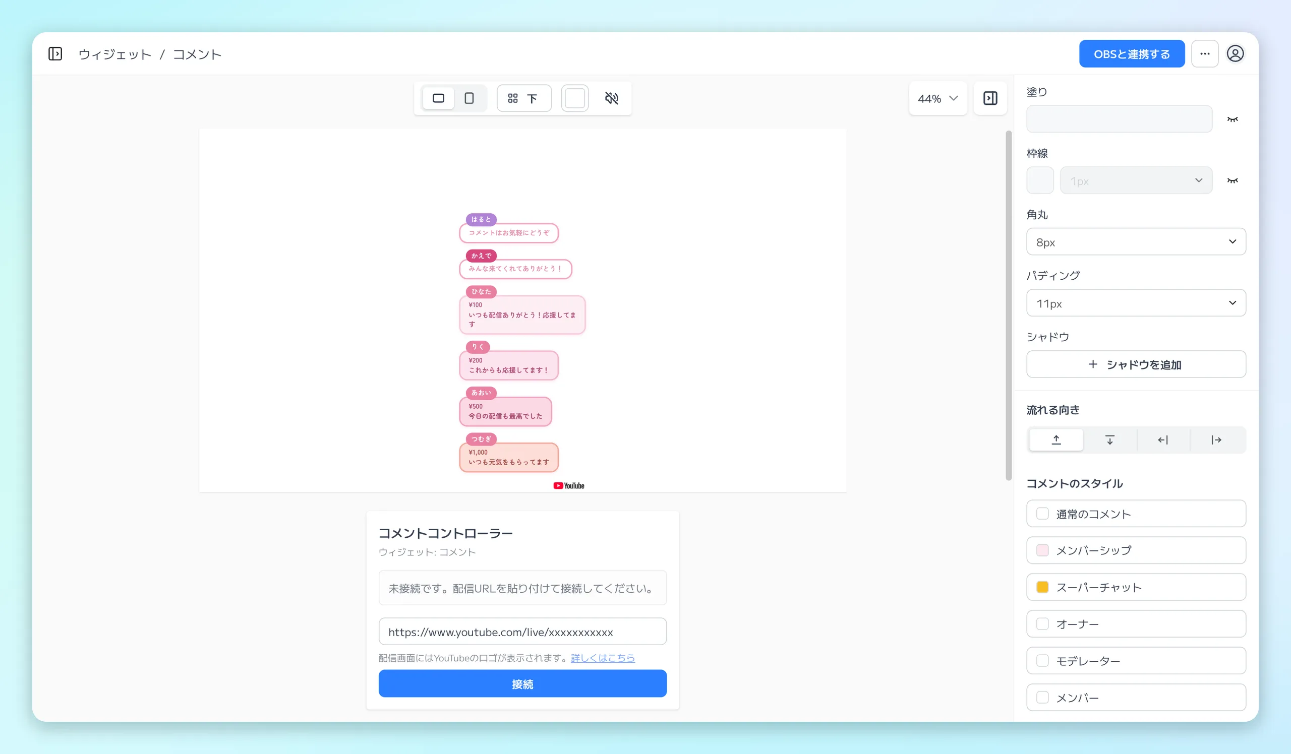
Paste the stream's URL into the comment controller's input field and press "Connect" to show that stream's chat.
The input field accepts any of these:
- The regular watch URL (youtube.com/watch?v=…)
- A youtu.be short URL
- The youtube.com/live/… form
- A bare 11-character video ID
Once connected, the video ID and connection time are shown. "Open on YouTube" takes you to the stream page you're connected to.
What the widget displays is the live chat of a stream that is public on YouTube. Connecting requires a live chat that is currently open, so pointing at a finished stream, an archive, or a regular video shows "Live chat is not open for this video."
When a stream ends, comment retrieval stops automatically and does not resume on its own.
- To display your next stream, paste the new stream's URL and connect again.
- If comments stop arriving on a stream that should still be live, press "Reconnect" to start retrieval over.
- To stop displaying comments, press "Disconnect" to release the connection.
Customize the Look
The design is configured in the widget editor. The quickest route is to start from a ready-made design in "Choose from template" and then adjust the details.
The right side of the editor holds "Box style" for the comment list as a whole and "Comment style" for each kind of comment.
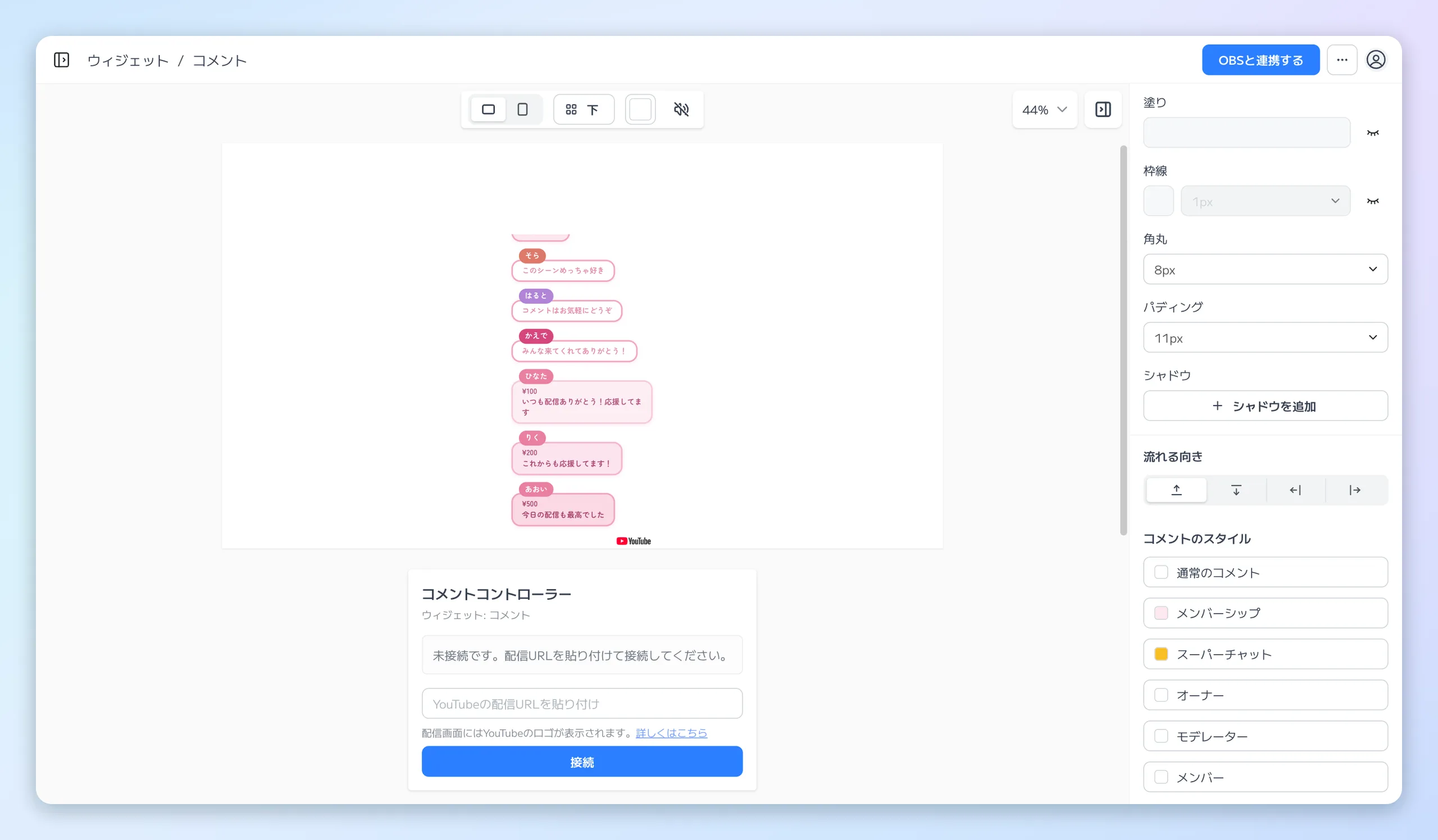
The top of the right side is Box style (the panel around the comment list), followed by Flow direction and the six Comment style buttons.
Box style
"Box style" sets up the panel around the comment list.
- The panel's fill, border, corner radius, and padding
- Its width and height
- The "Align" of the comments and the "Gap" between them
Below it, "Flow direction" lets you pick the side new comments enter from and the direction they flow, using one of four icons. Comments enter from the bar side and flow toward the arrow.
Comment style (the editing panel)
"Comment style" lists six kinds: "Regular comments", "Membership", "Super Chat", "Owner", "Moderator", and "Member". Any of them opens the same editing panel.
The left side of the editing panel is a preview you rearrange, and the right side holds tabbed settings. Drag the author name and the message onto the preview to place them. Clicking a part in the preview moves to its tab, and clicking a tab selects that part.
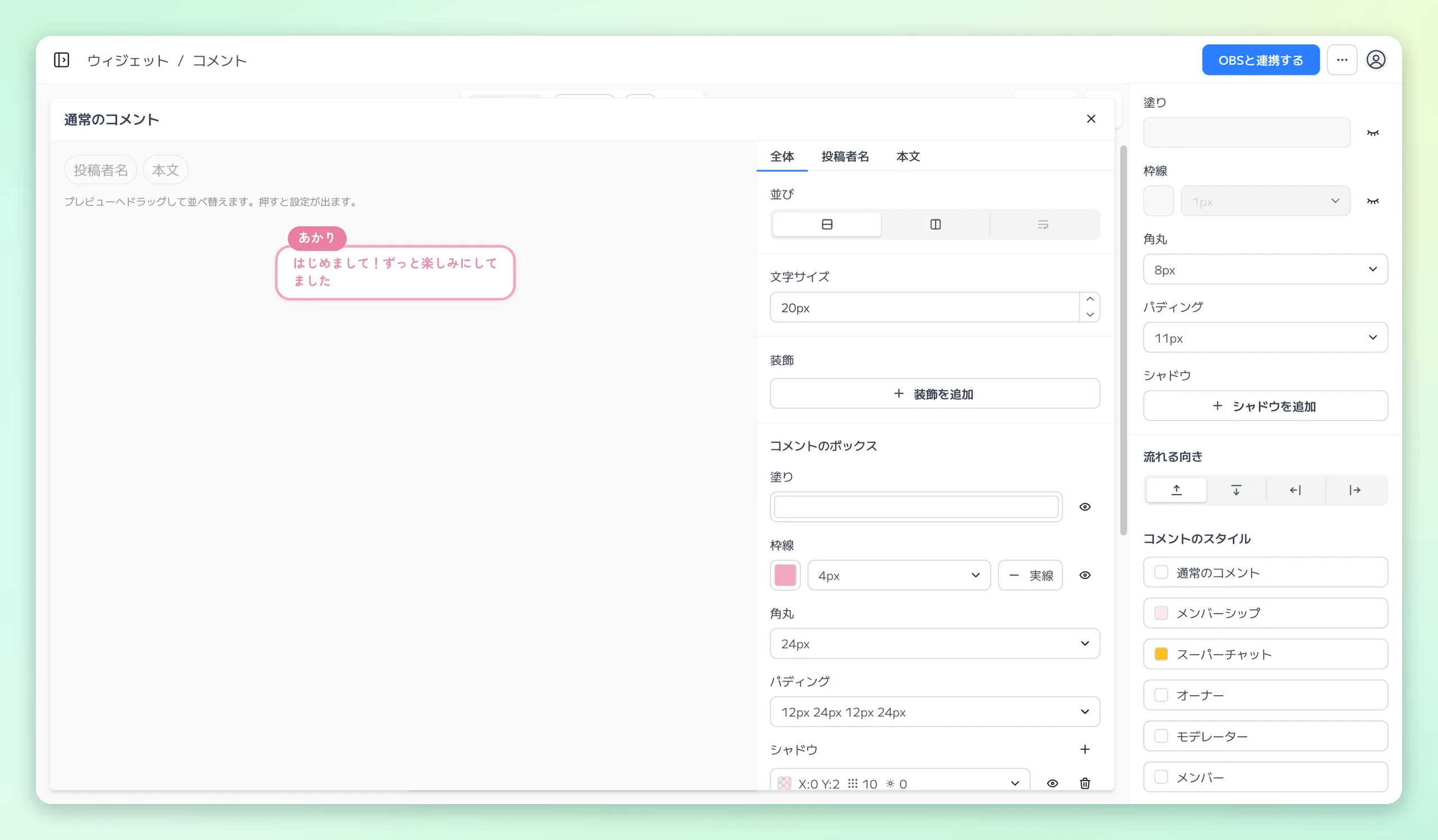
The editing panel that opens from "Regular comments". Set the arrangement in the preview on the left and fine-tune the look with the tabs on the right.
Each tab holds the following:
- "Overall" tab — down / across, "Same line as text", alignment, justification, and spacing, plus the fill, border, corner radius, padding, and shadow of a single comment
- "Message" and "Author name" tabs — font, letter spacing, text color, stroke, and shadow
- "Message" tab only — "Text alignment", which pulls wrapped lines left, center, or right, and "Margin", which insets the message alone
A border has a width field along with the "Sides" and "Line style" menus. They stay unavailable until the border has a color.
- "Sides" can be All, Top, Right, Bottom, Left, or Custom.
- Choosing Custom gives each edge its own width. An edge set to 0 is not drawn.
- "Line style" can be Solid, Dashed, or Dotted.
The author name and the Super Chat amount can sit above or below the row box, not only inside it.
- Drag them above or below the row in the preview, or pick it under "Placement" in the "Author name" or "Amount" tab.
- Left, center, or right sets the horizontal position.
- Put both on the same side and they share a single line, each with its own left, center, or right.
Note
- Super Chat, Membership, "Owner", "Moderator", and "Member" can override the message font, letter spacing, and margin on their own "Message" tab. When left blank, they follow the regular comment's "Message" tab.
- Inside a comment box or a group box that has a fill or a border, the contents are always trimmed to its rounded corners. To let a part overhang the box, place it outside the box and overlap it with "Offset".
Fonts
Fonts are chosen as a set of typeface, weight, and italic on the "Message", "Author name", "Amount", and "Membership" tabs. A chosen font applies to that part only.
- Font size is set on the regular comment's "Overall" tab.
- The "Amount" tab also sets its own font (typeface, weight, italic, letter spacing) apart from the message.
- On Membership, Super Chat, "Owner", "Moderator", and "Member", a tab left blank follows the same tab of regular comments. "Use the regular comment font" returns to it.
Note
- The "Text style" on the "Author name" tab of Membership and Super Chat (font, text color, shadow, stroke) is also a setting of its own for that kind.
- Unset items follow "Coloring" inside the box, and the regular author name outside the box.
- Shadows and strokes can be turned off with the eye icon.
Decorations
Under "Decorations" in the "Overall" tab, you can layer up to 8 icons, lines, and images combined onto each comment box. Pick the kind from "+ Add decoration".
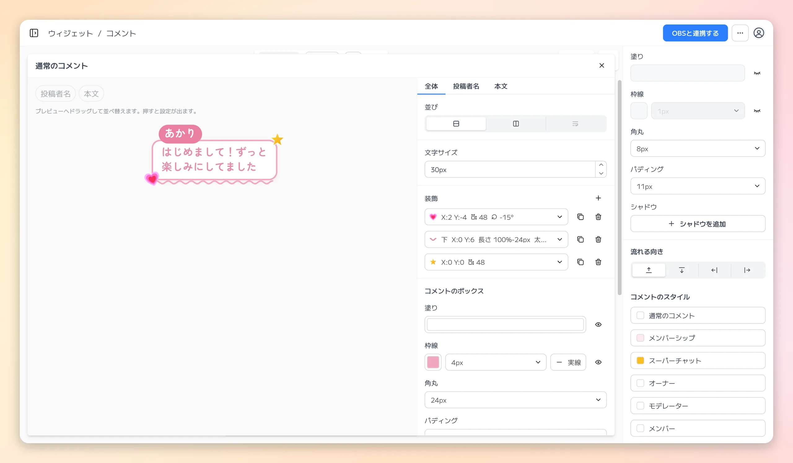
An example with a heart icon at the bottom left, a wavy line along the bottom edge, and an image (a star) at the top right. Added decorations are listed under "Decorations", and opening a row lets you change its position and size.
Every kind is positioned by an anchor point and X / Y from it. X is positive to the right and Y is positive downward. Icons and images have 9 anchor points on the box, and lines use the middle of each side.
The left shows the anchor points for icons and images (9 points), and the right shows those for lines (the middle of each side). Shifting from the top-right anchor with a positive X and a negative Y places an item outside the box's top-right corner, like the star.
Choose which side each decoration sits on with "Above the box" or "Below the box". Decorations can stick out past the box without being clipped.
Icon
- Pick a "Fluent Emoji" or "Tabler Icons" icon under "Icon".
- Set its position from the anchor point, its size, rotation, and horizontal flip, and which side it sits on.
- Drag an icon in the preview to move it. The handles that appear when you click it let you resize and rotate it (hold Shift to rotate in 15° steps).
- Tabler Icons icons can take a color. Until you pick one they use the message color (kinds that inherit them keep the color shown on the regular comment).
- Line-drawn Tabler Icons icons also let you change the "Line width".
Line
- Choose "Line" to add a line along one side of the box (left, right, top, or bottom).
- Its length is a percentage of the side plus a px adjustment, so it grows and shrinks with the box (100% and -24px leave 12px free at each end).
- "Line style" can be "Solid", "Dashed", "Dotted", "Double", "Wavy", or "Zigzag". "Thickness" is the thickness of the line itself for every style.
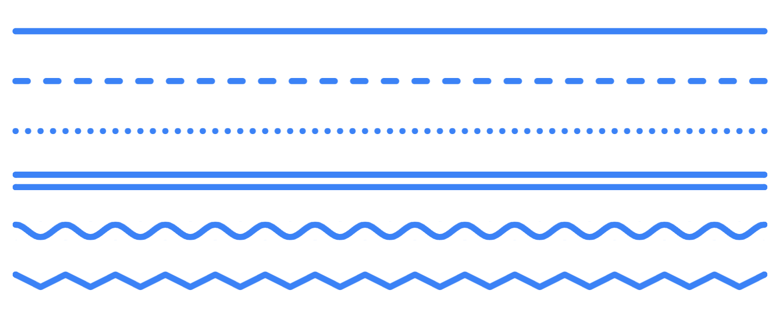
From the top: Solid, Dashed, Dotted, Double, Wavy, and Zigzag. All have the same thickness, with the gap set automatically.
- For Dashed, Dotted, Wavy, and Zigzag, "Gap" changes the space between dashes or dots and the width of each wave peak. Left blank, it is set automatically to match the thickness.
- "Ends" can be "Round" or "Square" (it has no effect on Dotted).
- With no color set, a line follows the box's border color (or the message color when there is no border), so it matches the amount tier on a Super Chat whose box has a border color.
- A line does not push the text aside, so leave room on that side with "Padding".
Image
- Choose "Image" to open the file picker. Pick an image you have already uploaded, or upload a new one to place it.
- Its position, rotation, horizontal flip, and which side it sits on work like an icon. Its size is set by "Width", and its height follows the image's aspect ratio.
- "Change image" swaps in a different image.
- Adding and replacing images is a Pro plan and above feature.
Note: inheritance by other kinds
- Membership, Super Chat, "Owner", "Moderator", and "Member" inherit the regular comment's decorations.
- Only what you change there, such as a position you drag, becomes their own setting. Anything you leave alone, like the color or icon, changes along with the regular comment.
- Deleting an inherited decoration hides it only for that kind. "Show" brings it back.
- "Use the regular comment decorations" at the right end of the heading discards everything you changed or added for that kind and goes back to the regular comment's decorations.
The Green Garden template shows icons, and the Neon Sign template shows lines in action.
Super Chat and Membership
Membership events and Super Chats can take a design distinct from an ordinary message. "Membership" and "Super Chat" also open in the same single editing panel, where you set their own flow, box, message, and author name.
- Membership also handles "Membership", and Super Chat also handles "Amount".
- "+ Group" creates a container you can move as one and give a fill, border, corner radius, or padding. A group fill takes the same patterns and gradients as the row box.
- With three or more parts in a row, dropping one beside another (left or right when stacked, above or below when across) groups those two automatically.
"Coloring" for Super Chats sits in the heading row of "Super Chat".
- "Color by amount" varies the color by amount tier.
- "Single color" uses the same color regardless of amount.
Under "Color by amount", an "Overall" option plus 1 to 7 appears next to it.
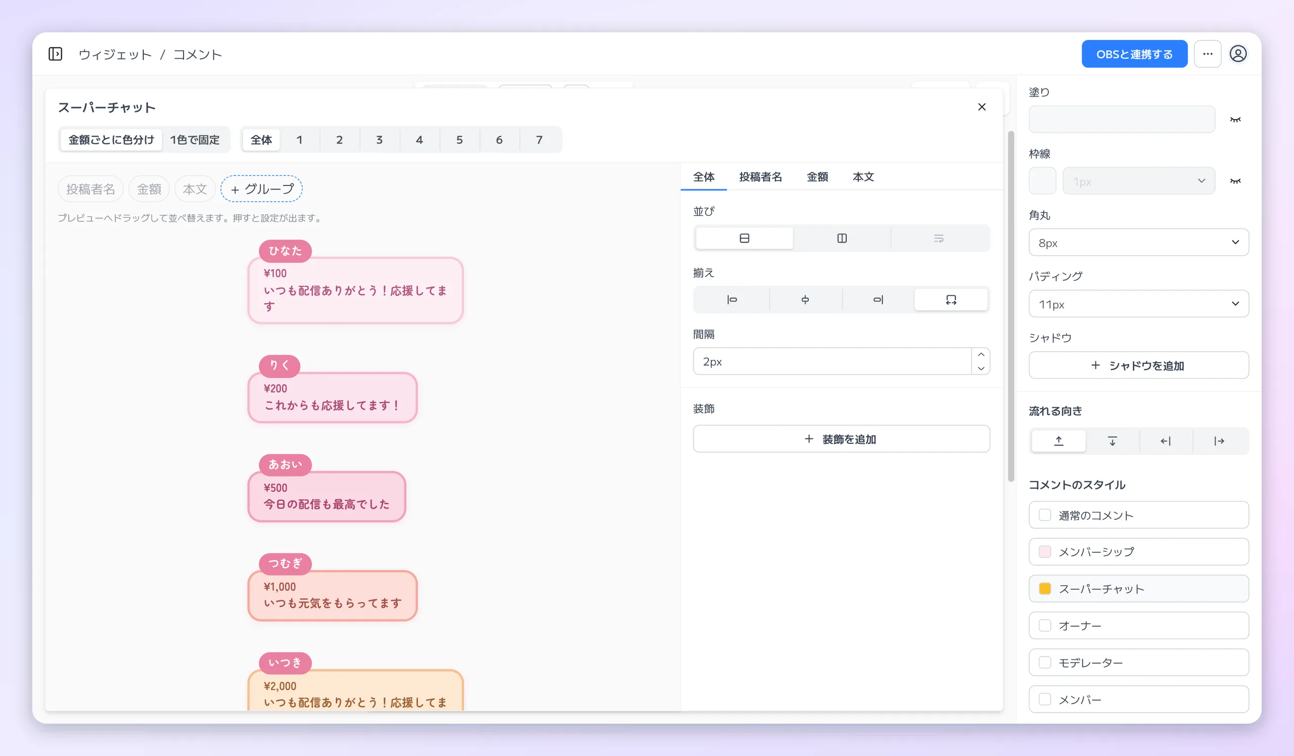
"Overall" stacks the samples for tiers 1 to 7 so you can compare the color of each amount tier while you edit.
- "Overall" — stacks the samples for tiers 1 to 7 so you can see every amount color at once while you edit the arrangement, the author name, and the amount. Dragging in any row updates the arrangement for all seven.
- A tier number — narrows the preview to that one sample, where "Box" and "Message" set that tier's box and text color.
Roles (Owner, Moderator, Member)
"Owner", "Moderator", and "Member" also open in the same single editing panel. An ordinary comment from an author with that role becomes that row, and you can override its own flow, box, message, and author name.
- Leave it untouched and it looks exactly like an ordinary comment.
- Once you have changed something, "Reset to regular comment settings" on the "Overall" tab puts the flow and the box back to the regular comment settings.
- The author name color follows the ordinary author name color until you pick a color for that role. "Use the regular author name color" below it puts it back.
About the YouTube Logo
The YouTube logo is shown on your stream. It makes clear that the comments on display were retrieved from YouTube.
The logo appears small, just outside the bottom-right of the comment area, and it cannot be hidden in the settings. Clicking it opens the stream you are connected to.
Reference: Developer Policies for the YouTube API Services
What We Retrieve and How We Handle It
The Comments widget retrieves only the live chat information that is public on YouTube for the stream you asked it to connect to. Specifically:
- The comment body and its timestamp
- The author's display name, avatar image URL, and channel ID
- The author's attributes (broadcaster, moderator, member, or verified channel)
- Information about Super Chat and membership events
- The information needed to identify the stream (video ID and live chat ID)
All of it is public on YouTube, and we never connect to your own YouTube account.
The live chat information we retrieve is used only to relay it to your stream display, and it is not stored in our database. For relaying, only a limited number of the most recent messages are held temporarily in our server's memory, and they are deleted when the stream ends or the connection is released.
Separately from the chat content, the information that identifies the connected stream (video ID, live chat ID, and connection time) is stored as part of the widget settings. It is removed when you release the connection or delete the widget.
If an author deletes their comment on YouTube, or if the author is blocked from the stream, we receive a notification from YouTube and promptly remove the corresponding display from your stream. Full details are in our Privacy Policy.
Use It in OBS with a Browser Source
Each Comments widget is published as a dedicated URL. Add an OBS browser source and set that URL to display it on stream.
You can adjust the size and position in OBS to fit your layout and balance it against your game capture or camera feed.
Adding it to OBS is a one-time step. All you do per stream is paste the stream's URL into the controller and press "Connect" — your OBS setup stays as it is. Any streaming software that supports browser sources can display it, not just OBS.
For the step-by-step setup flow, see How to Use Jamluca.
Stream Scenarios for the Comments Widget
- Show comments in a design that matches the mood of your stream
- Let viewers follow the chat while still watching your game capture or video
- Highlight Super Chats and membership joins to show your appreciation
- Make moderator and member messages distinguishable by color
- Make comments the main element on screen for a just-chatting or work-along stream
- Keep comments baked into the video for archives and clips